Interface Design for Displays in the Real World
May 5, 2022
Recently travelling on public transport around in the North East, I noticed the design of the interface on the passenger information displays had been updated recently. Bus operator Go North East has invested heavily into various iterations of their “talking bus” features. This typically involves auditory announcements for each stop, reminders of the service and destination and ocassional pre-recrded update messages.
Accompanying the auditory announcements, there is usually one of two different styles of visual announcements. One style is a large dot matrix display affixed at the front about 30cm away from the roof of the bus. Another is using a more traditional LCD screen encased in a rugged box. This style has been used across the Go North East fleet for many years, my earliest memory being it used to display the CCTV recording system so you could be reassured the system was working and recording.

Previously, the style of announcement looked very similar to a default PowerPoint presentation with some custom software switching between slides (once I recall seeing the PowerPoint audio symbol on a slide instead of off-screen).
Accessibility and Context

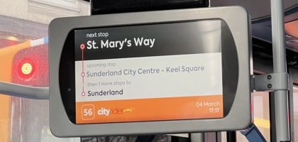
The design of these displays, and many other similar style displays I see tend to have been designed for a relatively small viewing distance. In reality, these displays ideally need to be readable from the back of the bus which can be up to 8 meters away. This means the amount of information you can stuff on at once is incredibly limited without reducing visibility.
My current vision is close to 20/20 with vision correction, and yet from half way down the bus I struggle to read the full contents of the display. Using the image as a reference, the “Next Stop”, so long as you know that it is the next stop at the top of screen, is clearly visible. However knowing where Keel Square or “Sunderland” are in the route is very difficult without further information. Travelling on a few different routes using this style of next stop announcements, they are equally as difficult to read.
However, on other buses where a Dot Matrix style display is used the visibility is much improved. While the display itself is not as tall, it is wider and in a more prominent position. In addition, due to the nature of the display are incredibly limited to the amount of information. This forces the use of scrolling to provide a legible result. However, I feel with these restrictions comes a better end product which matches well with the audio clips being played.

Connections

An interesting part of this upgrade is an attempt to fetch additional information about various possible connections. However, again visibility is very poor and almost feels as though it was designed by people who didn’t use the transport system itself. The list of National Rail connections, while useful, lists way too many consdering most railway stations in the region don’t have many destinations and are typically served by an hourly Northern service.
This tends to flicker between the different services available, even if it was unable to find any additional information. It’s also pretty unclear if there’s any delays and there is no auditory announcements for those with vision impairments.
While not as important to providing the next stop announcements, it doesn’t feel like a fully polished feature without the correct data backing. For example showing on approach to Sunderland Interchange that the closest light rail (T&W Metro) station was facing delays of X minutes would be appreciated than just a timetable. Or a more complex example could be, “There are delays to services from Durham including the Prince Bishops 20 to South Shields, etc”.
This is a more easily actionable item, especially as many passengers don’t feel comfortable using an app for everything.
Other Examples
Another example can be found across various parts of Tyne and Wear, but most notably at the new South Shields Interchange where each bus stop has an LCD display. There’s even a giant display of all of the destinations, the next service to use and the expected arrival time for that service into the station. This mirrors other displays that Nexus have employed across their networks, many of which are an older Dot Matrix style display.

These make great use of white, which on a display which requires a lot of backlighting to be visible, overpowers the fairly thin fonts used on the display. Also compared to the older style Dot Matrix, a decision was made to increase the number of buses displayed rather than to improve contrast and readability. Using a full colour display like this has the potential to show more detailed and dynamic information, such as if there’s delays to service however the real-time information only worked for a short while before resorting back to a timetable display.
Conclusion
It would be great if accessibility, especially from a distance and in context, was more of a factor when working with suppliers and in fact choosing a supplier for Passenger Information Displays. From our prespective, we use this feedback to improve our design for various different users of our client’s websites. From adding easier to tap buttons on mobile, and other shortcuts that are expected by visitors, to ensuring the website uses good use of a larger screen when available.
About the author
Web Developer
As a web developer with over 10 years of commercial experience working on a range of platforms and clients, owning Invisible Dragon allows me to take this experience and produce high-quality websites and web applications to small businesses.